So far, the trade talks have stalled, reemerged, stalled and reemerged once again, and the cycle shows little chance of stopping soon. There sometimes seems to be progress in resolving the trade disputes, but it often seems ephemeral, just beyond grasp. This has generated extraordinary turbulence in the financial markets and opens up substantial strategic opportunities for investors. But, just as there are two strong sides on the Chinese-US trade war, there are at least two strong opinions among investors. Some want to structure their portfolios as a hedge against fluctuations in China, some want to structure their portfolios to take advantage of any eventual resolution and its supposed positive impacts. Using the MacroRisk.com analytical platform, we have some hints to help both kinds of investors. For this post, we will especially be using MacroRisk’s patented Eta® Analysis that provides a look at the “Economic DNA” of a stock. Using the S&P 500 constituents as a search universe, we have found those stocks that have Eta® Profiles most like China, and those that are most opposite of China. To the extent that the trade war is reflected in the economic and financial variables used in the analysis, this may point the way to some investment opportunities for fine-tuning portfolios.
We will use two different methods to identify how “related” the stocks are to China.
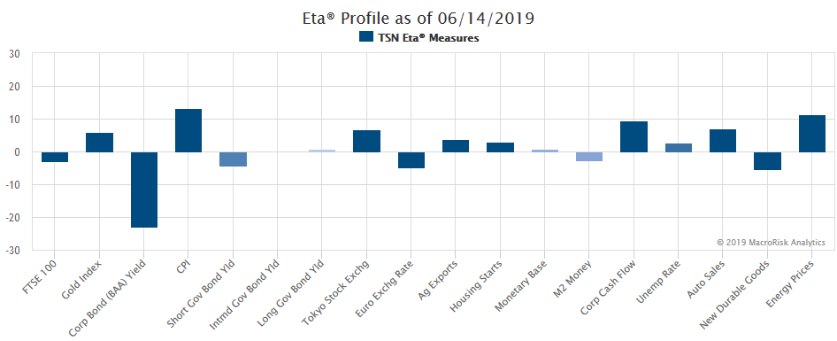
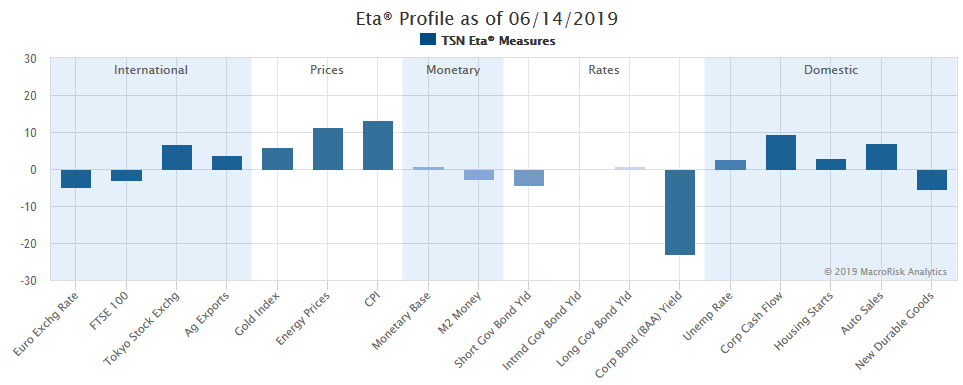
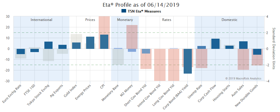
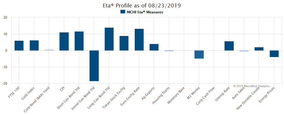
The first method involves the MacroRisk’s proprietary way of determining the sensitivities and the magnitudes of these sensitivities that assets have to 18 economics factors. For example, here are the historic sensitivities or exposures of the iShares MSCI China ETF (ticker: MCHI) to the 18 economics factors:
To select stocks that are least related to China, the MacroRisk Analytics will identify which stocks have the opposite sensitivities to these 18 economics factors. It’s extremely rare that there exist stocks with exact opposite sensitivities, but the MacroRisk Analytics platform will select the stocks that come the closest to satisfying this goal. So, this first method involves analyzing the historic, economic exposures that the China ETF and the S&P 500 stocks have to the 18 economics factors.
The second method involves the returns correlations of the China ETF and the S&P 500 stocks. Stocks whose returns move in opposite directions than the China ETF are deemed to be less related (i.e., low returns correlation) and stocks whose returns move in the same directions as the China ETF are deemed to be more related to each other (i.e., high returns correlation).
Now, let’s look at the five stocks out of the S&P 500 that are least related to China (i.e., ticker: MCHI) as of 8/22/2019 using MacroRisk’s Eta® Analysis, showing statistically based economic sensitivities to the economy (i.e., 18 economic factors):
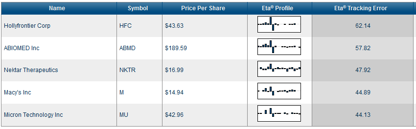
| Ticker | Sector |
| HFC | Energy |
| ABMD | Health Care |
| NKTR | Health Care |
| M | Consumer Discretionary |
| MU | Technology |
Using MacroRisk’s statistically based economic sensitivities, here are the five stocks that are most related to China:
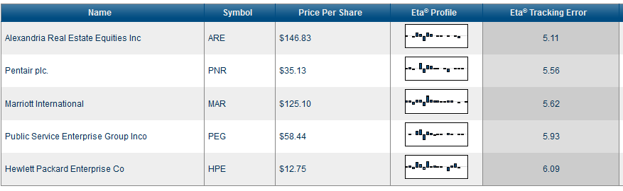
| Ticker | Sector |
| ARE | Financials |
| PNR | Industrials |
| MAR | Consumer Discretionary |
| PEG | Utilities |
| HPE | Technology |
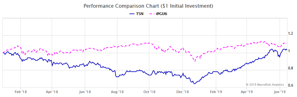
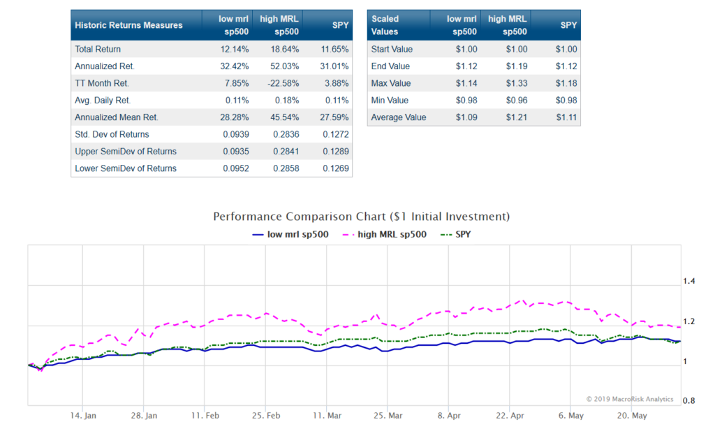
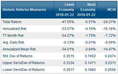
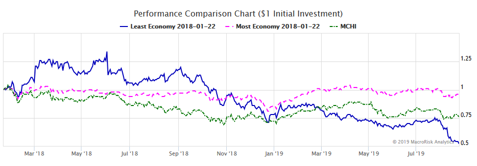
For illustrative purposes, we create two equally-weighted portfolios as of the day the trade war began, January 22, 2018. The first portfolio consists of stocks deemed to be least related to China on 8/23/19, and the second portfolio consists of stocks that are most related to China on 8/23/19. We compare the performances of these two portfolios to MCHI (i.e., China ETF). Please note that this illustration may be subject to a look-ahead bias because we are creating the portfolios as of 1/22/18 using “future” information available as of 8/23/19. Again, we present the information below for illustrative purposes only.
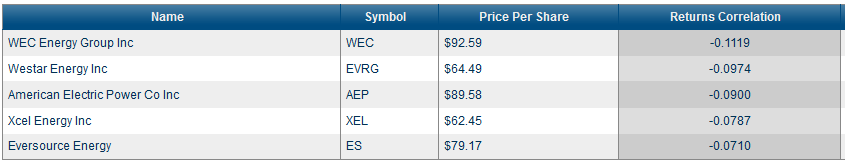
Now, let’s look at the five stocks out of the S&P 500 that are least related to China (i.e., ticker: MCHI) as of 8/22/2019 using the one-year returns correlation (i.e., 18 economic factors):
| Ticker | Sector |
| WEC | Utilities |
| EVRG | Utilities |
| AEP | Utilities |
| XEL | Utilities |
| ES | Utilities |
It’s worth noting that the five stocks that are least related to China based on the return correlation measure are all in the utilities sector.
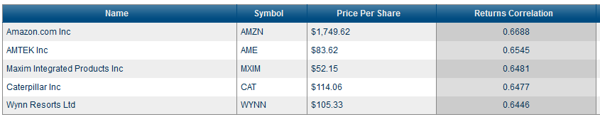
Using returns correlations, here are five stock that are most related to China:
| Ticker | Sector |
| AMZN | Consumer Discretionary |
| AME | Industrials |
| MXIM | Technology |
| CAT | Industrials |
| WYNN | Consumer Discretionary |
Amazon tops the list of stocks that are most related to China based on the return correlation measure. Many of the third-party sellers on Amazon usually source the products they sell on Amazon from Chinese manufacturers.
Similarly, we create two equally-weighted portfolios that are least and most related to China but now using the returns correlation. Again, the information below is subject to the look-ahead bias and is therefore for illustrative purposes only.
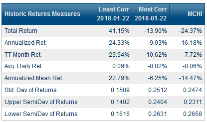
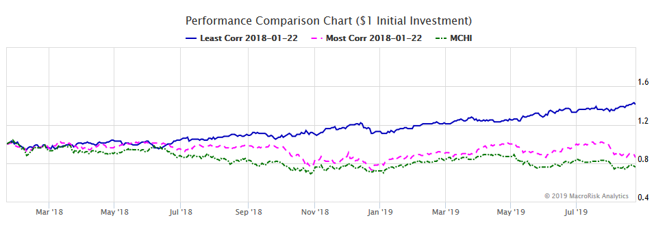
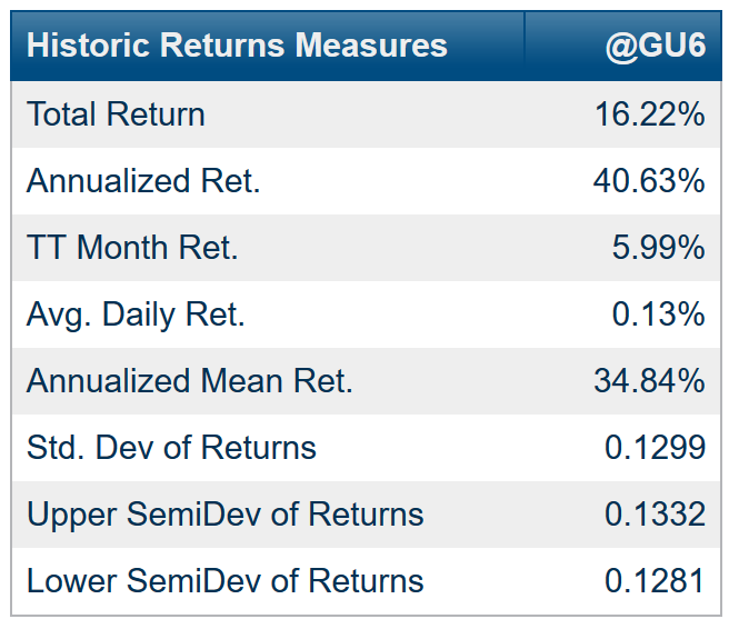
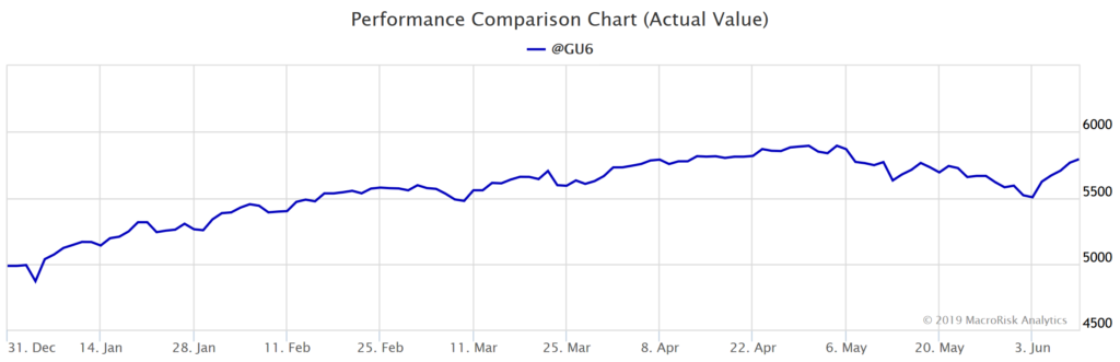
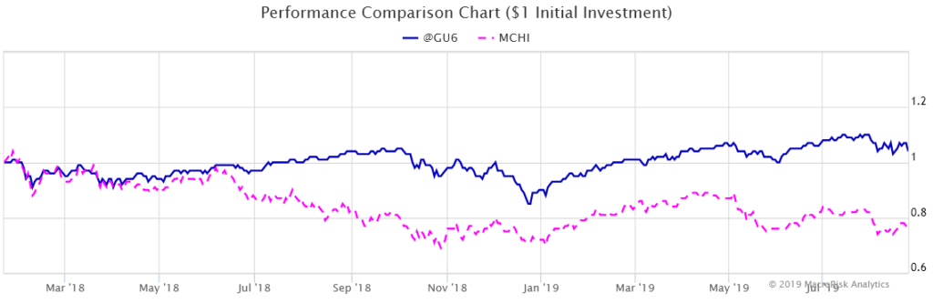
As can be seen, even the portfolio (pink line in the graph above) created as of 1/22/19, consisting of stocks most related to China as of 8/23/19, outperformed the China ETF (green line) which points to the U.S. market as a whole outperforming the Chinese market over the period from 1/22/19 through 8/23/19 as shown below. In the information below, the S&P 500 Total Return Index is denoted as “@GU6”, and the Chinese market is denoted as “MCHI”.
In this post, we have presented stocks out of the S&P 500 that are least and most related to China using two different methods. This can assist investors in navigating the marketplace while the trade war between U.S. and China continues.
MacroRisk Analytics has a selection of proprietary analysis tools that use macroeconomic variables to provide information on tens of thousands of stocks, mutual funds, exchange traded funds, and other traded assets. Click here to see how MacroRisk Analytics can help you.