As many of us might know, inflation has been on the rise. According to the Bureau of Labor Statistics, the annual inflation as of September 2021 is 5.4 percent. In our previous blog post published on April 19, 2021, we identified 10 Nasdaq-100 stocks that we expected to do well with rising inflation and 10 Nasdaq-100 stocks that would not do well in such an environment. Using the MacroRisk Analytics® platform, we look at the performance of these stocks and compare them to how the Nasdaq-100 index as a whole has fared so far. In addition, we identify another two sets of 10 Nasdaq-100 stocks that we expect to do well and not do well if inflation rises. Financial advisors and investors need to be aware of how inflation might impact their portfolios and assets.
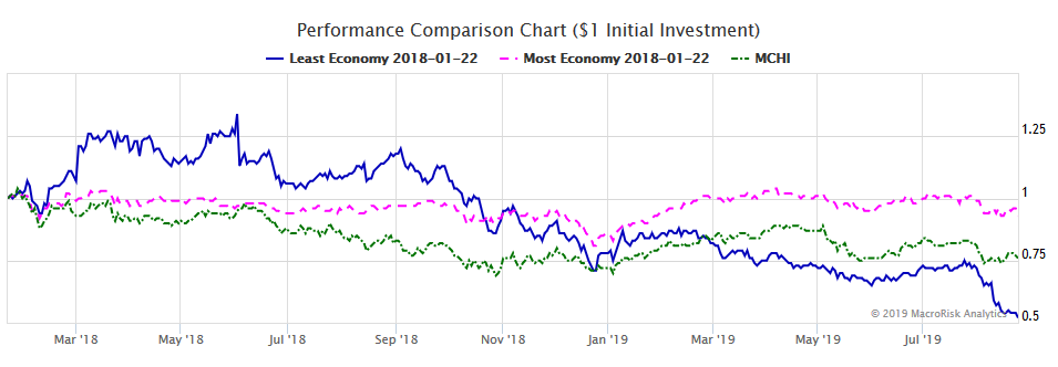
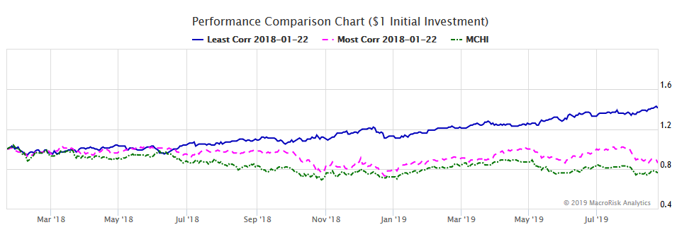
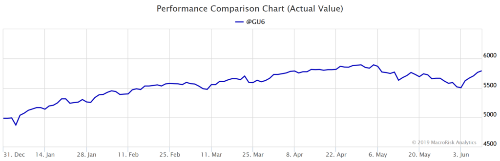
To perform the comparison, using the MacroRisk Analytics portfolios tool, I created an equally weighted portfolio of 10 stocks that were expected to respond positively to rising inflation (blue line in the chart below) and an equally weighted portfolio of 10 stocks that were expected to respond negatively (pink line). Then I compared these two portfolios to the performance of the Nasdaq-100 Index (green line) using the MacroRisk Analytics performance report. The chart below shows this performance from April 13 through October 13, 2021, a six-month period. (The starting date is April 13, 2021, because data as of this date were initially used in the previous blog post to identify the two sets of 10 stocks.)
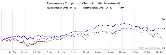
As can be seen, the portfolio of 10 stocks that we expected to do well in a rising inflation environment (blue line) did indeed do better than the Nasdaq-100 Index (green line) and the portfolio of 10 stocks that we expected to do worse in such an environment (pink line). The performance of the latter portfolio (pink line) and the Nasdaq-100 Index was somewhat similar over the six-month time period.
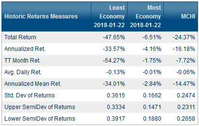
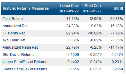
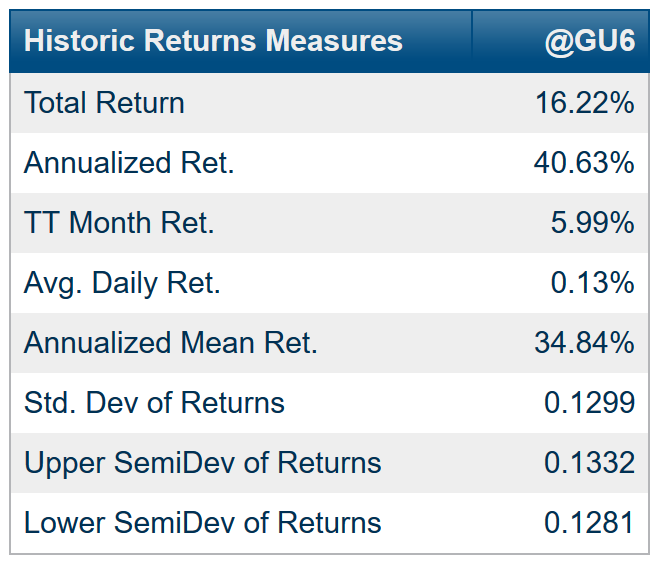
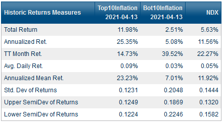
The table below shows the return and risk characteristics of the two portfolios and the index. The “top 10 inflation” portfolio also had lower risk than the index as represented by the standard deviation and the lower semideviation statistics, a good feat considering this portfolio consists of only 10 stocks while the index has 102 stocks.
So far, we have identified how the stocks we selected six months ago have performed through the present day. Next, I use the MacroRisk Analytics screening tool to identify new sets of stocks that we expect to do well and not well if inflation rises.
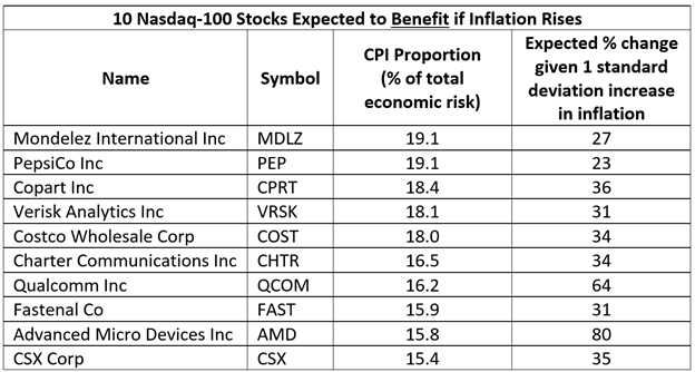
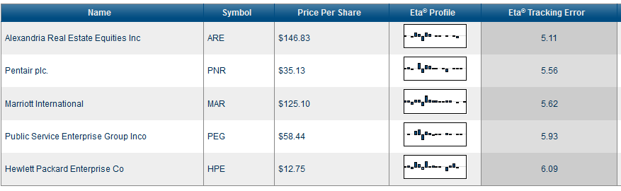
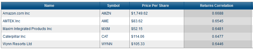
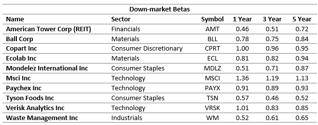
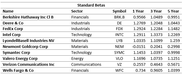
The table below shows 10 stocks out of the Nasdaq-100 Index that we expect to have the largest positive response to inflation as a proportion of total economic risk as of October 13, 2021.
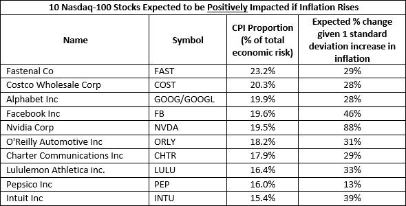
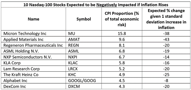
The third column represents the proportion of total economic risk that inflation represents for an asset. The higher the number, the more significant the expected effect of inflation changes are on an asset’s stock price versus the other 17 economic factors in the MacroRisk Analytics model.
The fourth column represents the expected percentage change in a stock’s price given a one standard deviation increase in inflation.
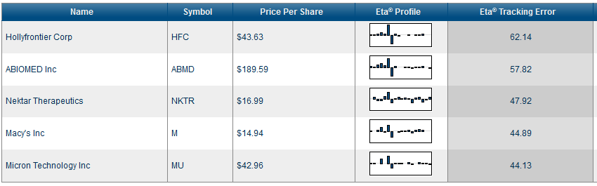
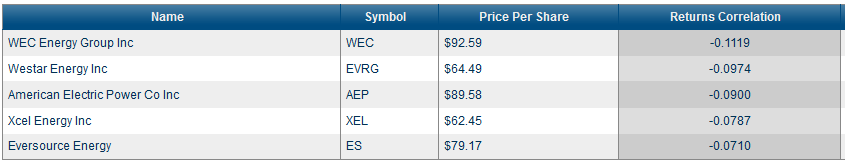
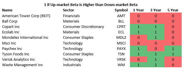
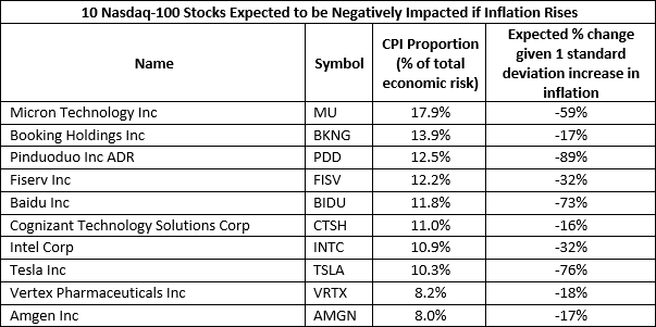
The table below shows 10 stocks out of the Nasdaq-100 Index that we expect to have the largest negative response to inflation as a proportion of total economic risk as of October 13, 2021.
In summary, this post analyzed the performances of two sets of stocks, identified in our previous blog post, that we expected to do well and not so well in a rising inflation environment. We then identified new sets of stocks using the most recent available data. Inflation is only part of the total economic risk, and other economic risks can have a big impact on the performances of individual stocks and portfolios. MacroRisk Analytics provides the proprietary and patented tools to help you measure these economic risks.
This post is possible thanks to MacroRisk Analytics®. This platform provides investment research for 30,000+ individual names as well as investor portfolios. The MacroRisk Analytics® model uses 18 macroeconomic factors to break down the economy’s impact on investment value. Using this patented research, our team has twice won the William F. Sharpe Indexing Achievement Award for ETF/Indexing Paper of the Year. Click here to access this award-winning investment research today! You can find our other blog posts by going to www.macrorisk.com.